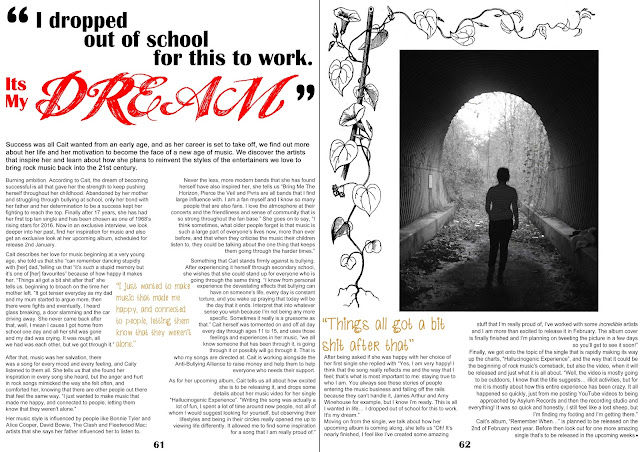
In this draft, I felt that the photo alone looked rather plain and had a large amount of white space around it, so I added a leaf and flower style border to the edges and also made my photo smaller. I feel that this looks effective on the page and also works well with the image as the leaves can still be seen in the background and the colour makes the border work well.
No comments:
Post a Comment