Saturday, 31 October 2015

Contents Page Analysis #5 - Research


This is a contents page from an edition of Uncut magazine. A large amount of the space on this contents page is taken up by an editorial piece, this is unusual for the contents of a magazine, as the focus is usually large images and list of what is being featured in that month or week's issue. After researching more into this cover, and the style of Uncut magazine, I have found out that they ask their editor to write a piece for the contents page of each magazine that promotes bands with a similar music style to that of the featured band/artist of that month. This would allow a niche audience to be created as the section would appeal to fans of the featured band that are looking to find more artists creating a similar sounding music and also creates a convention for Uncut magazine to keep their editorial piece in each magazine.

This is something that appeals to me and is something I would like to include in my magazine as it allows readers to try a new type of music they may not have before and is helping to break down boundaries between different music genres, something I would love to achieve with my magazine.

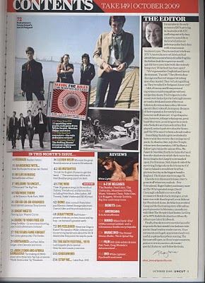
The magazine has taken an approach to their layout that I do not like, there is a list of the main feature articles and then above that there is a small selection of images that are relating to some of the articles. The font sizes for the title of each article are all the same, along with the colour of each. Underneath, a summary of each article has been included and this is in a smaller font size and also in black rather than gold for the colour.

The heading for the section is in a red banner and the writing is in a white, block capital font. Both of these things allow the text to stand out and be easily red. The red makes the heading look more important, and also allows the red background of the review section next to it look brighter and more important than the other articles and draws the readers attention.


By including mostly black and white colours on the contents page, the use of the red background shows how important the article is and makes it a focus point of the page. By placing it next to the editors piece it allows those two sections to work together to make the information come across more arrogantly and separately to the remaining information on the page.


On this contents page, there are neutral coloured images which again reinforces the brightness of the red, and the calm colours make the imaged look sedate and cool, and the centre of the images contains the product placement of an album, perhaps one being given away with the magazine or as another article image about a new album. This is different to the rest of the group or live shot images and then is more noticeable on the contents between the images.

How this research has influenced my ideas and creativity:

Each time I analyse a contents page set up in this format and layout, it reinforces the fact that I would like to break the conventional vintage rock magazine layout and bring something to a more modern audience. I also like the use of the red to indicate something important as it is eye catching and also holds a symbolic sign of importance,

Thursday, 29 October 2015

Initial Ideas

For my magazine I would like to include:

  • The dark clothing and makeup usually associated with the rock genre, by keeping to conventions it will allow the genre of my magazine to be obviously noticeable on the shelf.
  • For my colour scheme I would like to use red, black and white shades, this is another convention associated with rock.
  • I would like to have a medium close up image for my front cover.
  • I think I would like to include a prop, maybe a microphone or a guitar. 
  • I would like to have a double page spread focused on a musician and their life rather than being focused on music entirely.
  • I think I would like to include a music free download or a code for money off or free shipping for a website.
  • I think my cover will feature a female, probably looking directly into camera.
  • The background may be quite plain.
  • There will be a lot of articles featured on the front page to ensure there is an attraction to a wider audience.

Sunday, 25 October 2015

Institutions Research #3 - Time Inc.


Time Inc. is the second largest media company in the world after Disney. They have major divisions in areas such as publishing, internet production, television and telecommunications. They are based in New York and specialise in publishing, having a portfolio of over 90 magazines, including Time magazine, Sports Illustrated, People, Fortune and InStyle.


Time Inc. merged with Warner Communications in 1990 and created Time Warner, until 2014 when the company spun off and Time Inc. continued separately. In January 2007, Bonnier Magazine Group bought 18 magazines from Time Inc. to produce themselves, the price paid is thought to be around $267 Million.


On the Time Inc. website, they include links to all of their social media pages so that customers can follow them for instant reports and updates rather than waiting for a magazine or newspaper to come out. These include Facebook, Twitter and LinkedIn


The company is global as they have  offices in different countries and their publications reach worldwide audiences.

How this research has influenced my ideas and creativity:

Time Inc. do not currently have any music magazines in their publications, so therefore, they could be a company to approach about taking on the magazine I am creating. However as the company have recently sold magazines to Bonnier Media, they could perhaps be the next company to research into and to see whether or not they have any music magazines of my genre.


EDIT: I have been back through and answered the questions below. They helped to expand my knowledge for the company and the audiences they reach.


Saturday, 24 October 2015

Front Cover Analysis 5 - Research

This is a cover from Vintage Rock magazine, one that I will be researching into in detail as it is exactly the same genre as what I have chosen to produce, however this magazine focuses more on older rock artists, whereas I would like mine to have more of a younger audience and so I will be focusing on artists from around the late 60's, early 70's and the 80's eras.

On this cover there are three puffs, two of the same style just reversed and one of a different shape and colour.


The two yellow puffs are advertising a longer article from the magazine and the other what the special edition of the magazine is about. The third is advertising a different article, the type of which I would like to include in my own magazine, a review article. The bright colours of the puffs stand out from the background and the black and white image, therefore making them an eye catching feature on the cover.


The Vintage Rock masthead is placed in the upper third of the magazine, with Elvis's head slightly covering the masthead and sell line.

The same sans serif font is used throughout in different sizes and colours, the only different font is the masthead. It is simple and easy to read in both colours and allows the article contents to be read clearly. It also creates a synergy for the cover as all fonts, no matter what placement or colour are the same, including the sell line.

The central image is in black and white, which is linking to the Vintage in the masthead, it allows the theme of the old music to continue, and the main focus on music can be seen as the image is that of a live performance, it shows Elvis as a performer, mouth open and singing with his guitar as a prop. Dyer can be applied here as he says that "a star is an image". It is clear that Elvis would have had a life around music, and many other magazines and tabloids would have reported this, but the way this magazine has presented him is just as a musician and a performer.

The barcode has been set conventionally in the bottom right hand corner of the magazine. My magazine will also include this convention as it is a simple code that is easily kept for a magazine and alongside other aspects that may break convention, it will be a simple way to keep the magazine a classic.How has this research influenced my creativity and ideas?This magazine cover has told me that a black and white image could be useful in representing the vintage era, and that when advertising anything on the front cover, the best way to do so is to use brightly coloured puffs and banners.

Thursday, 22 October 2015

Double Page Spread Analysis #2 - Research


This double page spread is based around Buck Owens, a popular American musician from the around the 1960’s to 1980’s. His music was a country style that incorporated elements of rock and roll. In 1959 he released a single called “Under Your Spell Again”, which is also the title of this article, this would appeal to his audience, and by making this the title of the article, Classic Rock magazine is drawing in a wider audience than they may usually attract.


The article is mostly in black and white, with a large image taking up over 2/3 of the page. This makes the red used for the title then more obvious than the rest of the page. The font used is a serif font and is the same as the drop capital on the beginning of the body of text. Red has symbolic signs that relate to power, and by making the title larger than the rest of the text and in the red colour it draws the reader in and makes them wonder what the rest of the article will include.

Reads: To celebrate the release of Buck 'Em! The Autobiography Of Buck Owens we present, in association with Hal Leonard/Backbeat Books, extracts from the king of The Bakersfield Sound's essential memoir.

The lead of the article, written under the title, describes what this double page spread will be about, in this case, it is releasing exclusive extracts from the autobiography of Buck Owens. Written in bold is Owens’ name on the second line, instantly this stands out from the text and allows the customer reading the article to know who the DPS is about if they don’t recognise the picture. Using the bold font makes the two words striking and more noticeable in comparison to the rest of the text.


In the image, the artist has been styled looking down at his guitar, making him seem like music is the most important thing to him, Dyer can be applied here as he states ‘a star is an image’ and by staging this, the photographer has created an image of Buck Owens that his audience and the magazines audience will like to see. The black and white photograph allows the genre of vintage to be clearly seen and the use of the black and white image next to a body of text in black font surrounded by a significant amount of white space allows a synergy and house style to be created on the page. This style also allows the large red title to be striking and appealing.

The black and white image is very simple, the background shows what looks like the inside of a theatre and there is a man in a white shirt walking through, this is all blurred out however as the camera has been focused on Owens, perhaps suggesting that now he has released his autobiography, the focus will be moved from his band as a whole and more onto his life outside of the band and his experience in the music industry.


How this research has influenced my ideas and creativity:

This is only the opening pages of the double page spread; however, I think as the start of an article, this is very effective. There is not a large amount of text on the page as the image and title take up the most amount of space, even then, in the space left there is only a short paragraph. This allows readers to take in the image and the title, and for those who know of Buck Owens’ music, the title being his song title too, and then to read the lead and possibly the first paragraph to then decide if they want to carry on. This would be especially effective if the customer was going to be reading a page or two in the shop before buying the magazine as it would allow their attention to be grabbed by this double page spread and to buy it, maybe listen to some of Owens’ music. I would like to recreate something similar to this as I love how the image is the main focus of the page, and how the star has been styled to match Dyer’s theory.

Wednesday, 21 October 2015

Institutions Research #2 - Guardian Media Group


Guardian Media Group owns newspapers like The Guardian and The Observer. The company co-owns Emap Performance Network Ltd. alongside Apax. As far as publications go, the company focuses more towards reporting the news and some tabloid stories over other genres of paper or digital publications.

This could possibly be a company worth approaching with the idea of them taking production of a music magazine, however there are many news headlines that indicate the industry for music magazines is decreasing, in an article published on the Guardian newspaper website that states the print sales in the first half of 2014 lost nearly 1 million pounds, and the Music Week website confirms that this is again true for 2015, specifically that rock magazine sales have been suffering considerably in the first half of the year.

As the magazine I am creating is a Vintage Rock magazine, this tells me that I would have to create a magazine with content different to any other on the market currently so that not only would it be appealing to a printing industry but also to a different style of market to ensure the sales would create enough profit for an industry to deem it feasible to take on and produce.

Guardian Media may be a company worth considering as they currently do not have any music magazines in their production, however they also mainly produce news and lifestyle magazines, and therefore may not be interested in the production of a music magazine.

Guardian Media Group Homepage

Tuesday, 20 October 2015

Target Audience Profile - Planning

Target Audience: Vintage Rock
  • Age: Predominantly aimed at ages 15-18, however with the genre, there is the possibility of an older audience, so when writing my double page spread I will accommodate the language I use so it may appeal to a more mature audience.
  • Gender: I would like my magazine to appeal to all genders, and I will try to achieve this by using colours that are not usually stereotyped to a gender, e.g. blues and pinks, unless necessary and for a specific effect.
  • Sexuality: Again, I would like my magazine to appeal to all sexualities and I will try to achieve this by not having provocative poses or fashion choices on my magazine.
  • Race & Ethnicity: Hopefully my magazine will appeal to all races and ethnicities, however, it is more likely to have a western/white audience than anything else due to the origin of the bands and the type of culture they appeal to.
  • Class: Middle/Lower class, rock music is more likely to appeal to a lower class audience and has throughout history, however music barriers are breaking down and therefore there could be some audience in an upper class setting.
  • Lifestyle: There could be a range of lifestyles for my magazine audience, however the most likely will be a working person or a student, therefore my magazine needs to be interesting and entertaining so that it could be used for relaxation. The type of more mature customer could be someone who liked the music of the bands/genre in their youth and went to concerts etc. and continues to this day to enjoy the music and would like to know more about the artist/band and the life they lived during the time the customer was a fan.
  • Culture: The culture for my magazine will be more of a western world, and enjoying the style of music of the genre is essential. 
  • Fan Bases: My magazine would appeal to the fan bases of bands like AC/DC, Led Zeppelin, Jimi Hendrix, Pink Floyd, Deff Leppard and Elvis Presley.
  • Hobbies and Interests: The customers for my magazine could be interested in old style, vintage rock music, vintage films or even more modern ones that use that style of directing and production and music relating to the genre. They could also be into fashion and the style of clothing associated with this genre of music, such as leathers and ripped jeans and large boots. The audience could also be very into going to concerts and gigs of bands that are in this genre or style of music, therefore I would like to include reviews of concerts and albums, and dates for tours, reunion tours, singular concerts or album/single release dates.
  • Fashion: The younger audience of my magazine especially may be very into fashion and the style of music associated with this genre, so including coupons or discount codes for stores or online shops that stock stereotypical rock style clothes could appeal to my audience. Stores such as Hot Topic, Pulp, Asylum Industries and Blue Banana would be the main, most known shops for this style of clothing by the audience.